Improvements to the Wiki Creation Process
- XWiki
- Feature
- Idea
 Thiago Krieck
- No
Description
Flavor Selection
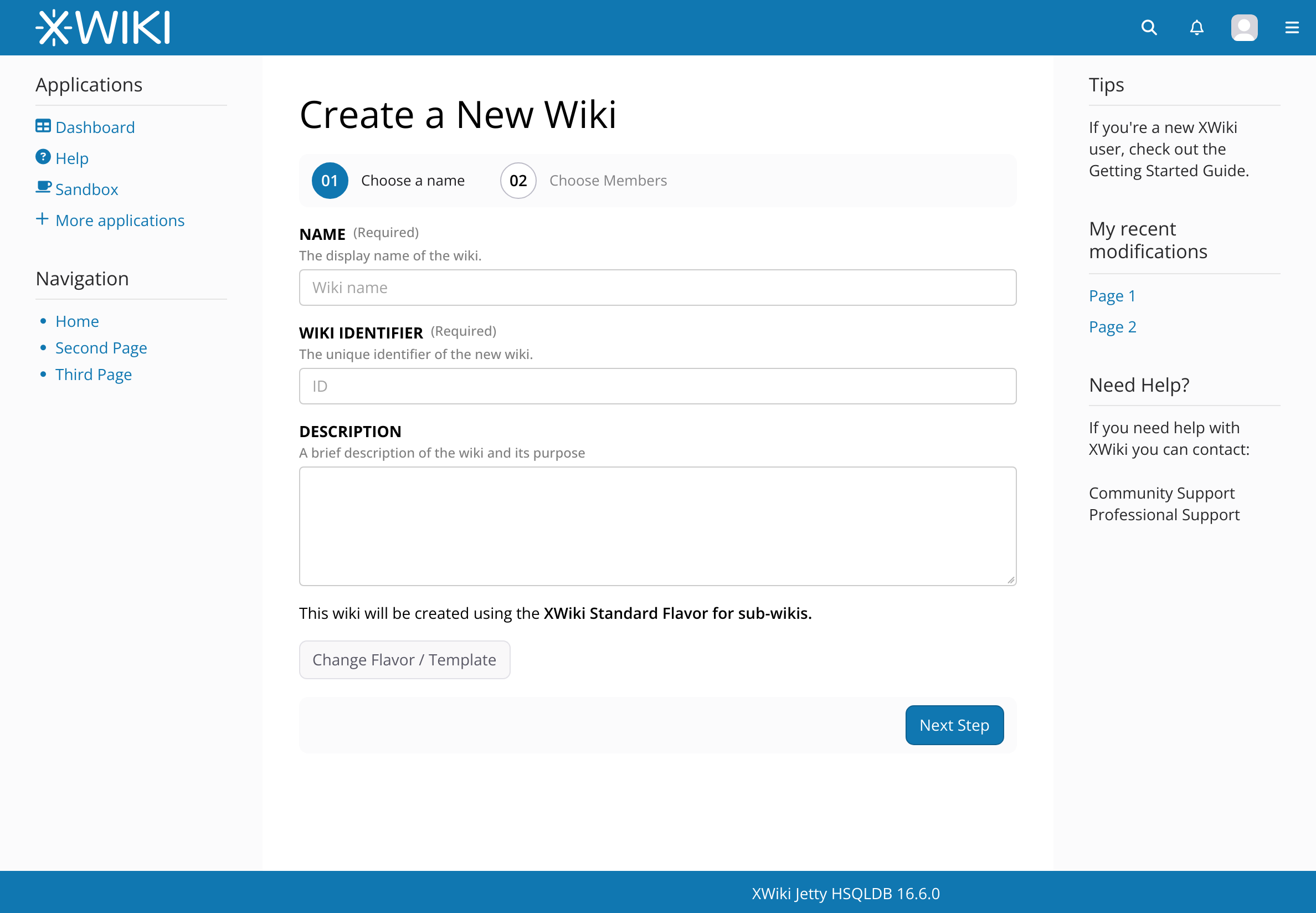
The primary goal of this proposal is to have the standard flavor pre-selected by default, as noted by @vmassol on @surli 's behalf on the Jira. But also, to introduce some friction to the flavor selection process, to make it just a little bit harder to select, inadvertently, the completely empty wiki.
We can achieve this by informing the user that the Standard Flavor will be used, while also providing an option to change it. The option “No Flavor, this wiki will be empty” would be hidden by default. See the example below:
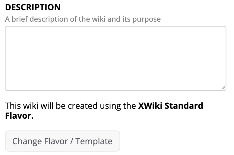
When the user clicks the Change Flavor / Template button, the controls for flavor selection would appear, offering the following options:
- Select a Flavor (defaulting to Standard),
- Select the “No Flavor” option, which would disable the flavor selection box,
- Go to the Template tab.
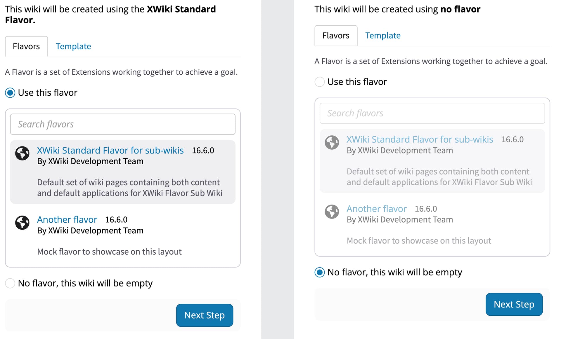
In this version, these options are displayed directly below the main form (currently, they are on the right). This layout is intended to keep everything more contextual, following a top-to-bottom flow. While it may take up more horizontal space, I believe that making a once-in-a-while process more “guided” is more important than being exclusively space-efficient. However, I’d love to hear your thoughts on this approach.
Other Changes
These next changes, while proposed for the wiki creation flow, could impact other screens as well. If accepted, they might need to be broken down into more specific Jira tasks.
1 - Selected Wizard Step
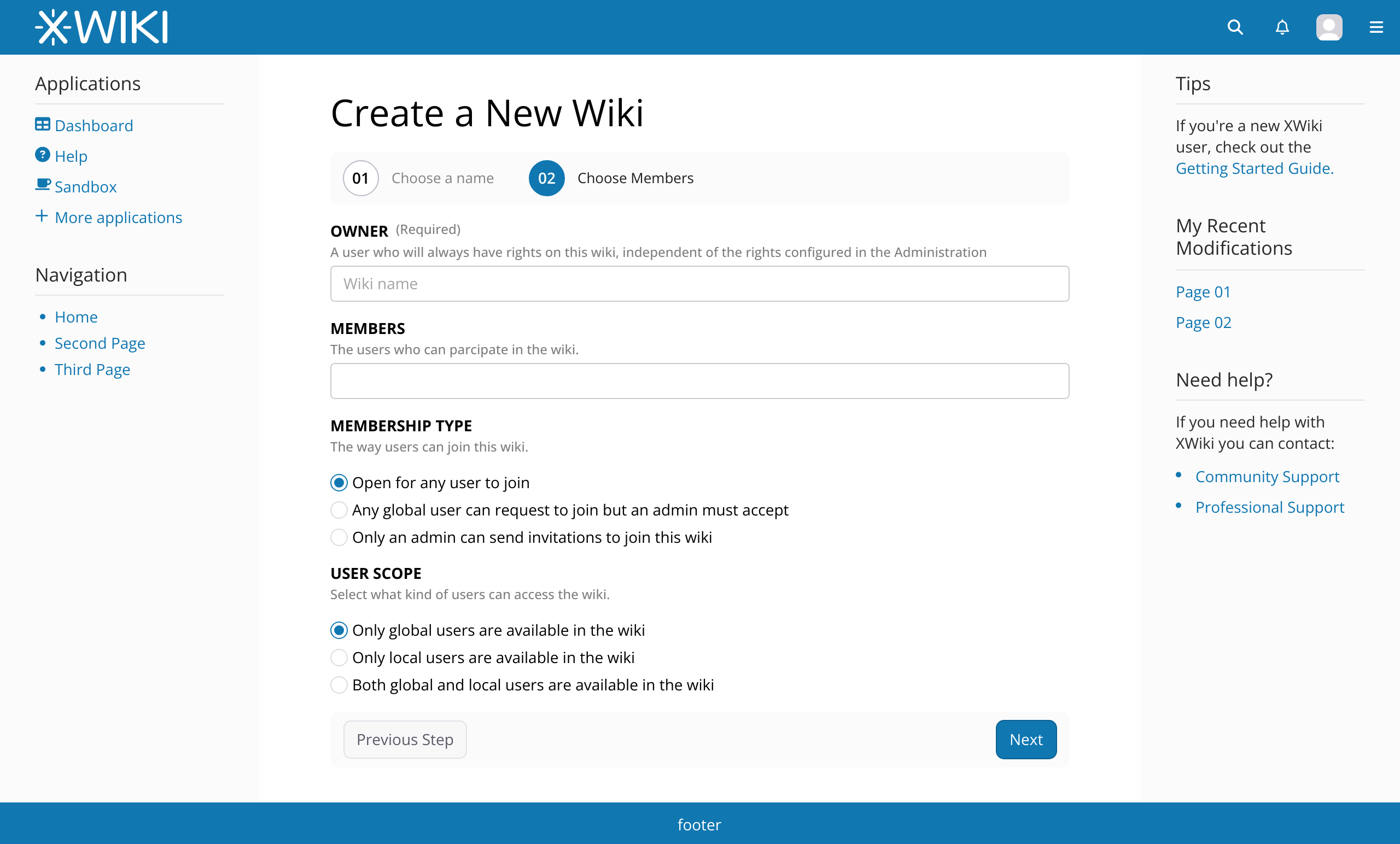
Although the main focus of this Jira is the flavor selection, there’s room for other improvements. For example, the steps in the Wiki Creation wizard currently give visual prominence to steps that are not the current ones. This is especially noticeable in a two-step situation like this:
Example: What’s selected here? While you might think that the “Users” screen is selected, it’s actually the other way around.

It would be better to invert this logic and give more visual prominence to the current step.
Proposal:

2 - Integrate Page Title and Step Indicator
While we’re at it, we could also integrate the step indicator with the current page title, cleaning up the interface and bringing the step indicator into view, as it currently sits in the far-right corner of the screen.
Current:

Proposal:

Note: here on the forum both images appear to be of different sizes, this is because the resolutions I usually work in Penpot. Please, see the context images at the end of this post to get a better understanding on the proportions.
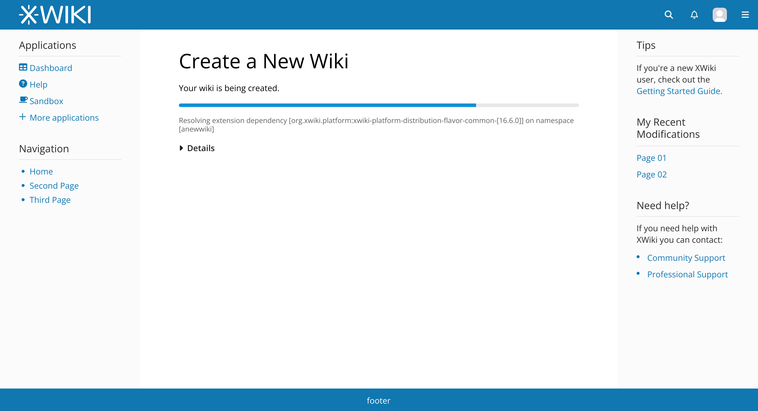
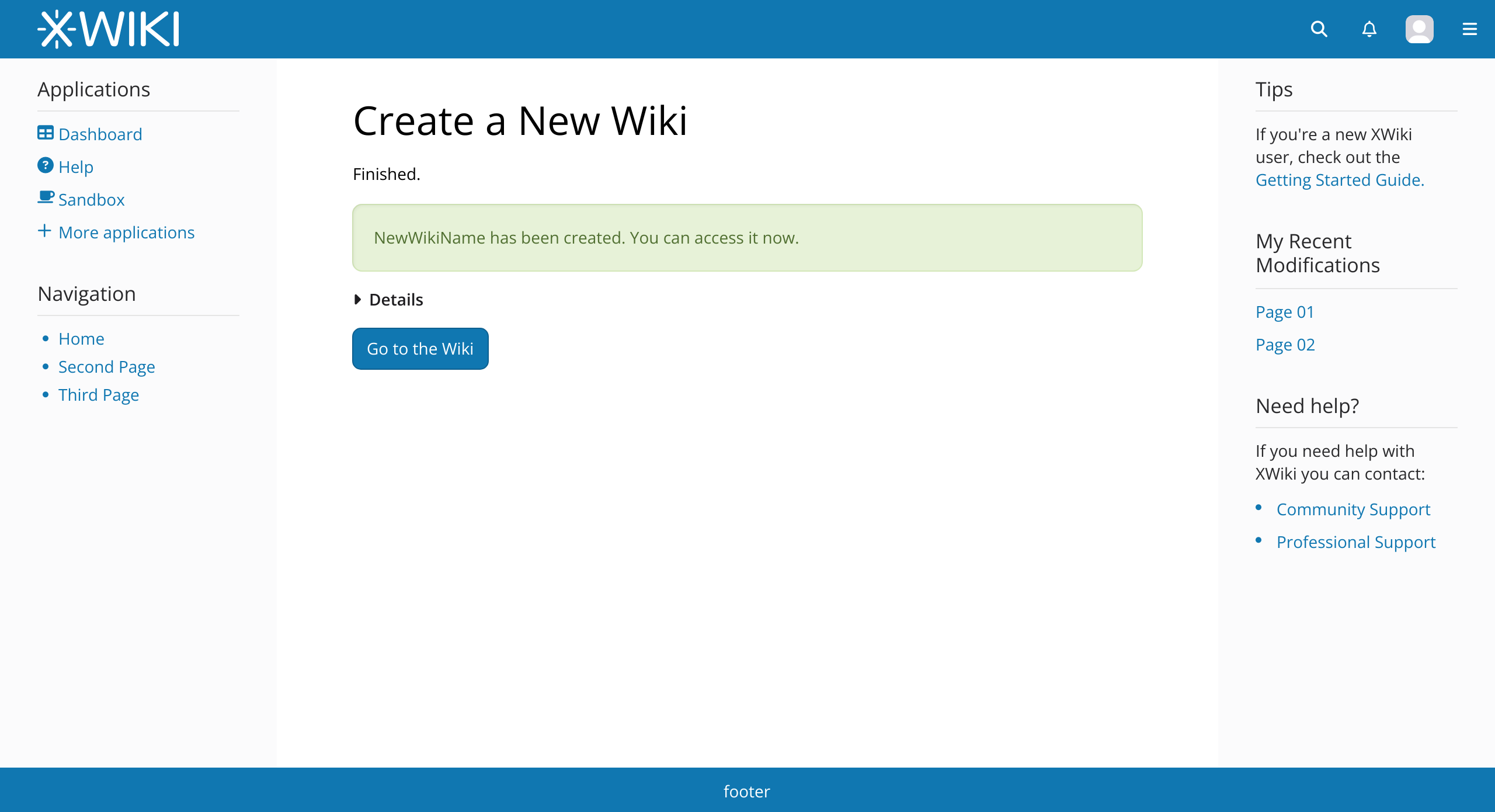
3 - Creation Progress Bar
The final proposed change is to the progress bar at the end of the process.
To streamline the interface, I propose hiding the previous steps under a “Details” panel that can be opened (default: closed) while showing only the current step beneath the progress bar. The bar itself would remain the same, with a possible color change to align it with the theme’s primary color.
The “Go to Wiki” button could be left-aligned to make it more visible.
Additionally, I suggest minor changes to text content and styles, including removing the blue color from non-link text and eliminating outdated icons.

All Changes in Context
To wrap up this post, here are all the proposed changes in the context of the whole screen: