Onboarding Cristal
- Cristal
- Feature
- Dormant
 Thiago Krieck
- No
Description
Drawing inspiration from the approach used in XWiki, I suggest dividing the onboarding into two distinct flows:
- First-Time Run: Intended for administrators to configure the application.
- First-Time Use: Designed to guide end users through Cristal’s main features.
In this post, I will outline both flows and provide an overview of the proposed structure.
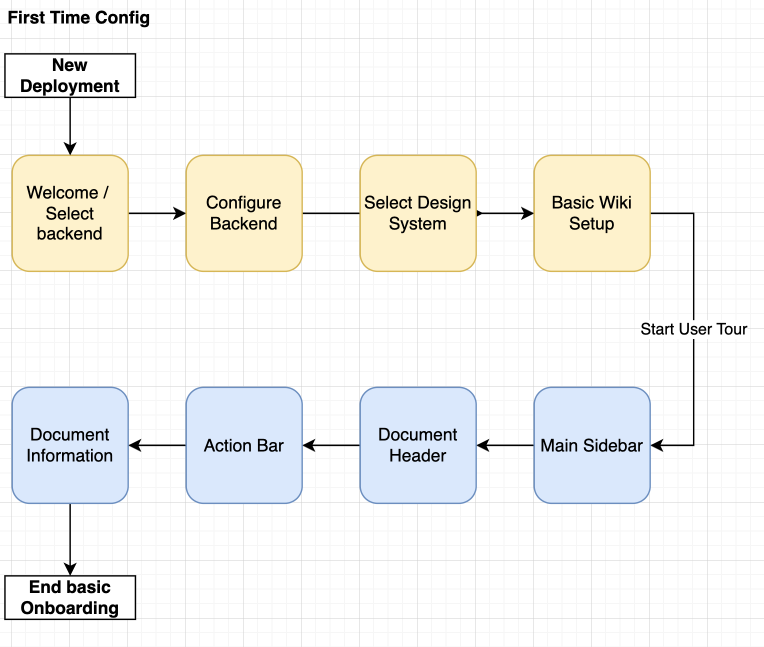
The overall onboarding flow is represented below:
First-Time Run (Administrator Setup)
This flow is aimed at administrators during the initial setup of Cristal. The suggested steps include:
- Backend Selection: Choosing the backend service to be used.
- Backend Configuration: Setting up the selected backend with the necessary parameters.
- Design System Selection: Selecting the design system to be applied.
- Basic Wiki Settings: Setting up initial wiki details such as the name, logo, and potentially other configurations.
Layout Proposal
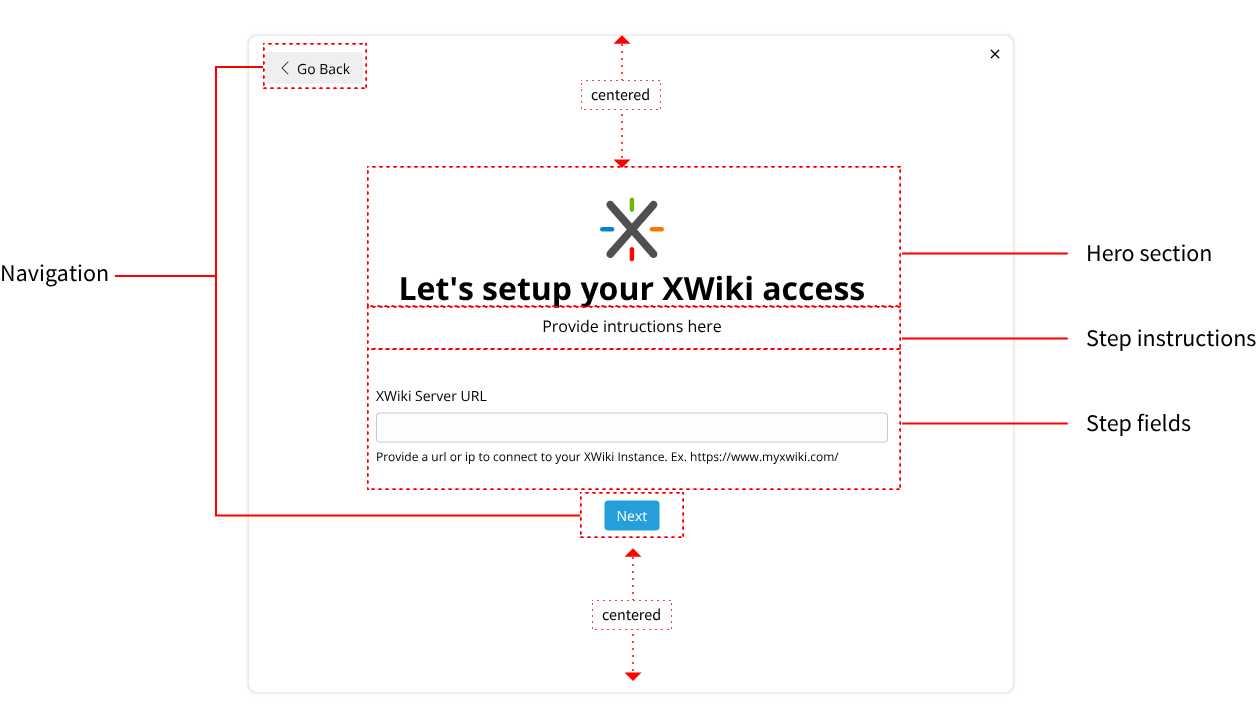
The initial configuration flow would follow a simple structure:
- A dialog or basic page (to be decided during implementation).
- A Hero section introducing each step with basic instructions.
- A form section containing the necessary fields, varying significantly by step.
- Navigation buttons for user progression.
Step 1: Backend Selection
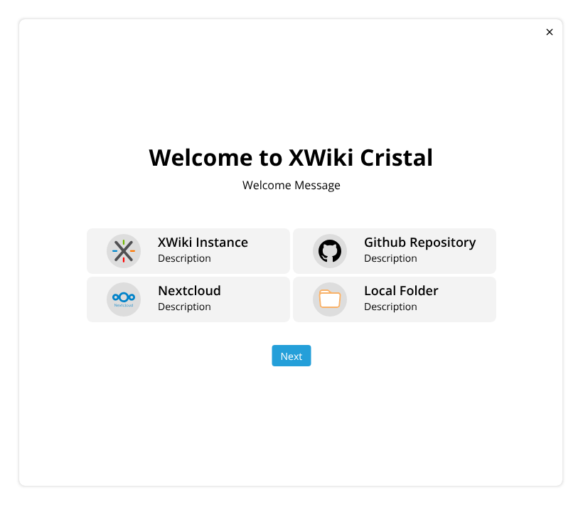
The first step combines a welcome message with backend selection.
select backend 1820×710 26.7 KB
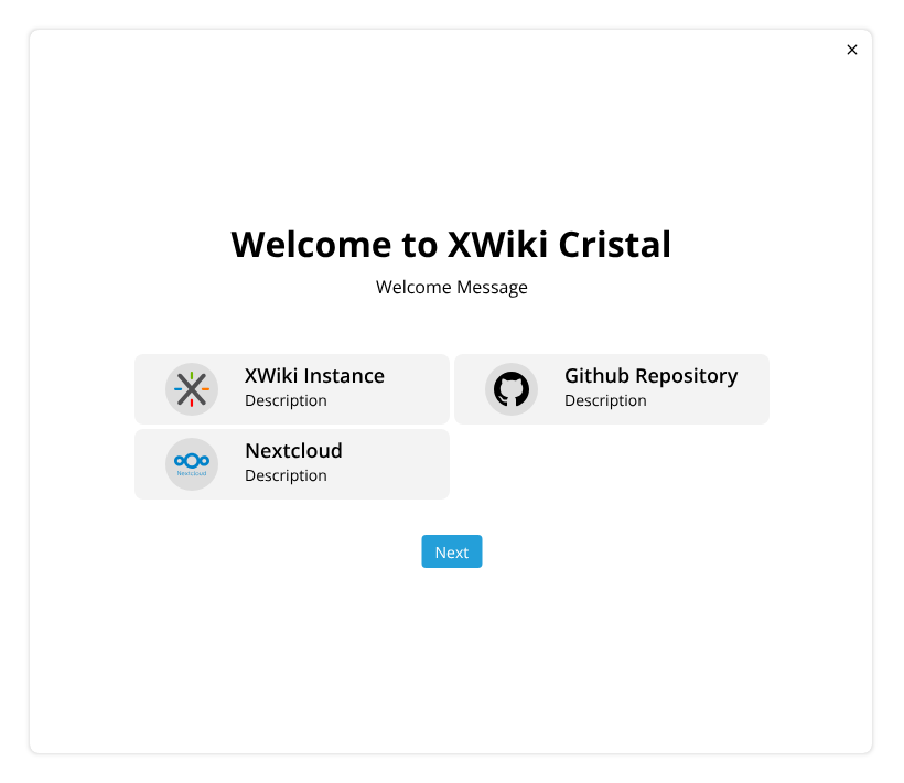
The available backend options may vary depending on Cristal’s deployment environment (for example, “Local Folder” may not always be present).
select backend 2820×710 24.9 KB
Step 2: Backend Configuration
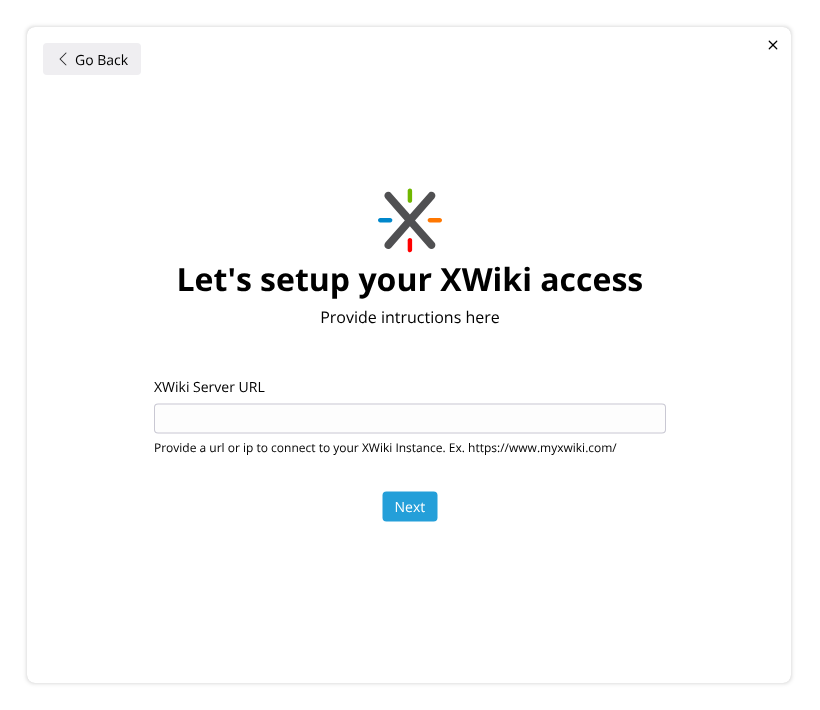
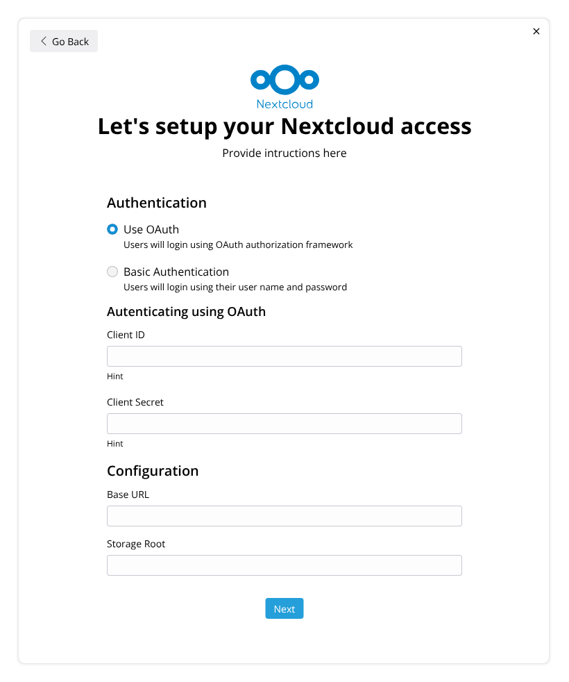
Based on the chosen backend, a tailored configuration screen will appear.
Some configurations may require more extensive screens or even multiple sub-steps.
Example: XWiki Backend
configuring the backend - XWiki820×710 21.8 KB
Example: Nextcloud Backend
configuring the backend - Nextcloud820×982 42.4 KB
Step 3: Design System Selection
If multiple design systems are available, users will be prompted to select one. If only one design system is detected, this step will be skipped.
It’s important to include visual elements (such as logos) to enhance the selection experience.
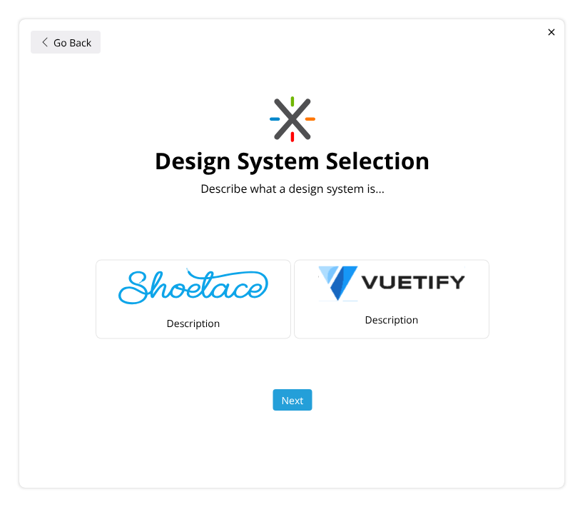
Design System Select 1820×710 26.4 KB
Example with Shoelace selected:
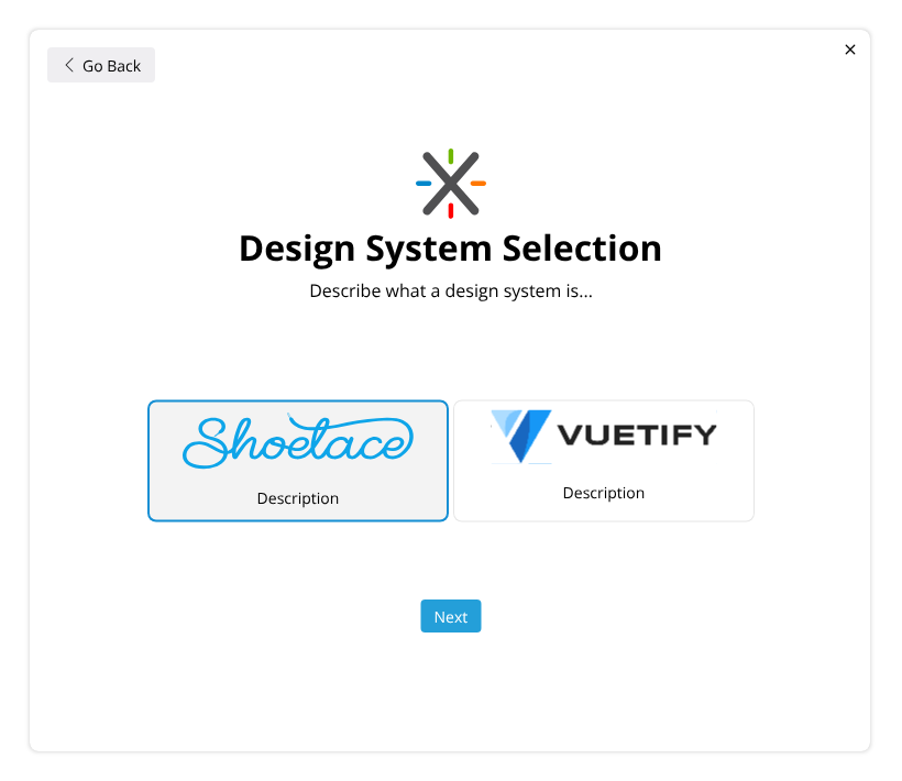
Design System Select 2820×710 27.9 KB
Step 4: Final Configuration
In this final step, users will input key details about the wiki, such as logo and name. We could also consider adding basic user creation at this stage.
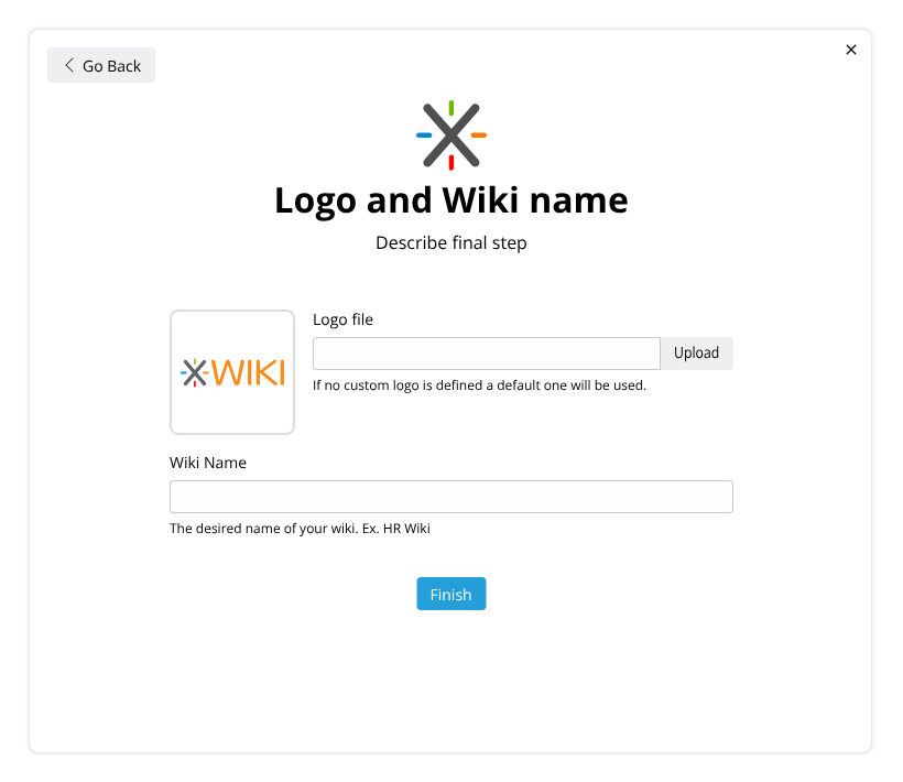
Final configuration820×710 25.6 KB
After completing this initial setup, users will be transitioned directly into the First-Time Use flow within the newly configured wiki.
First-Time Use (End User Tour)
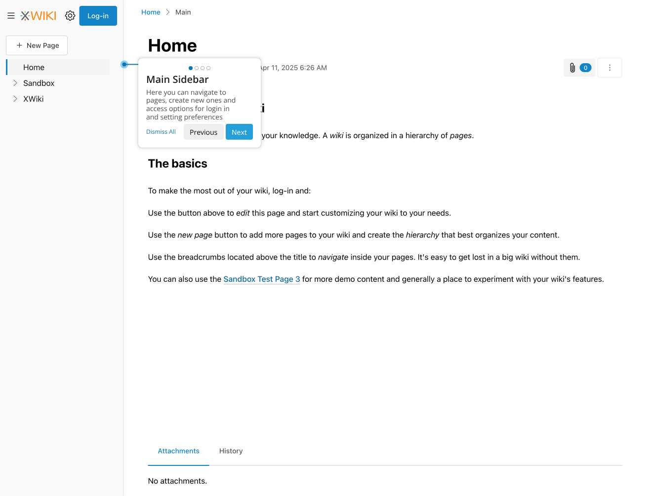
After setup, end users will be welcomed with a short guided tour of Cristal. The goals for this tour are:
- Provide a quick, clear orientation, similar to XWiki Standard.
- Highlight major areas of the UI.
- Introduce key concepts succinctly.
- Keep the entire experience under one minute.
Layout Proposal
The tour will follow a simple layout with familiar elements (similar to XWiki Standard), and will include a step indicator for better clarity.
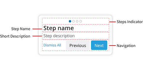
Proposed Tour Steps
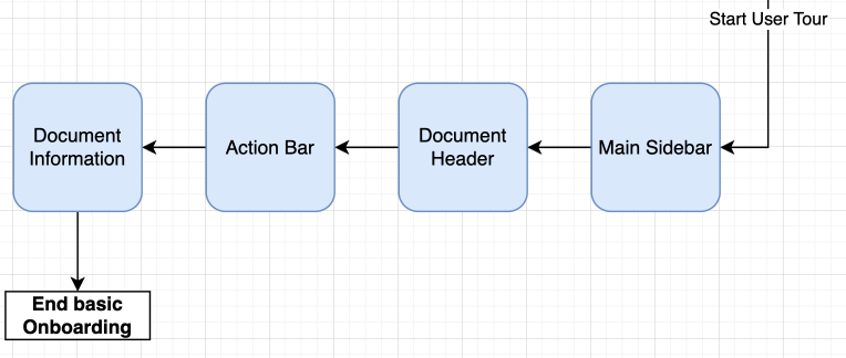
first time use flow764×324 16 KB
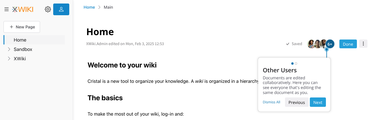
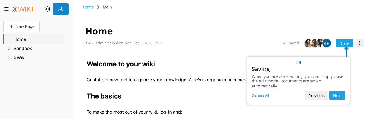
The key areas introduced during the tour include:
- Main Sidebar
- Document Header
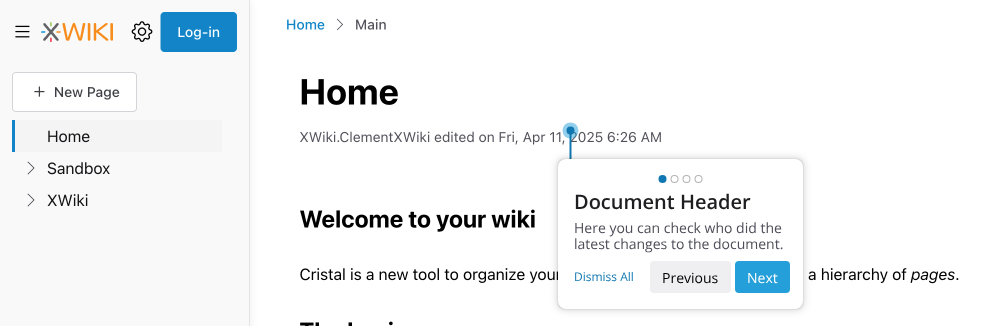
user - document header981×326 34.2 KB
- Action Bar
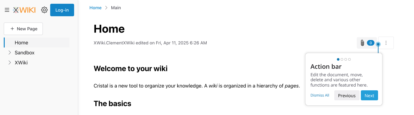
user - actionbar1324×368 40.5 KB
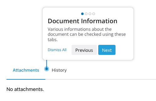
- Document Information Tabs
Contextual Onboarding
Cristal’s onboarding can dynamically introduce new steps based on user actions. For example:
- After logging in, users may be introduced to the Edit button.
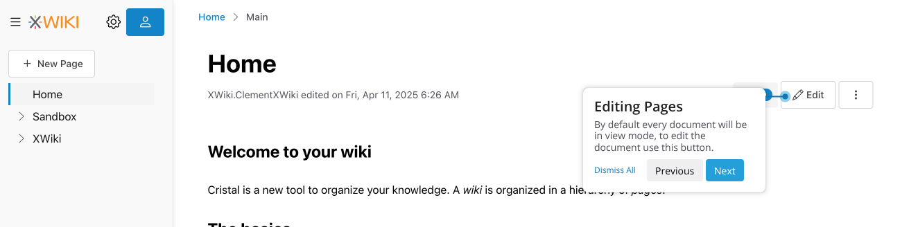
- After clicking “Edit”, users can be guided to the user list functionality, particularly useful in collaborative environments.